Park Chicago
CLIENT:
Park Chicago (speculative)
ROLE:
UI Design, UX Research
DURATION:
10 weeks
TEAM:
(5) Camille Forster, Janiya Garner, Barrett Light, Van Ma
Parking in Chicago can be stressful, costly, and confusing, adding to already negative perceptions of city privatized parking. We saw opportunities in the Park Chicago app to alleviate stress that comes from this experience. How can we better support users' financial needs and use design to signify a move towards a more equitable future for parking?
What we did:
Interviewed Park Chicago users about their experiences with parking in Chicago
Reduced financial barriers to parking
Modernize UI through an updated design system
Increased accessibility by ensuring WCAG compliance

We interviewed 11 users of the Park Chicago app with the goal of learning:
What frustrates users while parking (not limited to just with the app)
How the Park Chicago app helps relieve pain points or contributes to them.
We also asked users to walk us how they would pay for a parking space using the app, narrating their thoughts as they went.
Current app interface

What we learned:
Users wanted more payment method options and disliked being forced to reload their account by $20 each time it ran out.
App interface is outdated and cluttered, lacks visual hierarchy.
Some users reported having trouble extending their parking sessions or missing the end of their parking time due to poor notification from the app.
Users found it difficult to find available spaces, often circling the block to find one
When first using the app users reported low/mixed confidence with correct zone selection and parking rules.
Redesign

INSIGHT #1:
Users wanted more payment method options and disliked being forced to reload their account by $20 each time it ran out.
SOLUTION:
Add additional payment methods to the checkout process. If not possible, remove the initial $20 deposit necessary during the signup onboarding.

INSIGHT #2:
App interface is outdated and cluttered, lacks visual hierarchy.
SOLUTION:
Remove cluttered text to reveal only when applicable to the user.
Use intentional icons for scanability
INSIGHT #3:
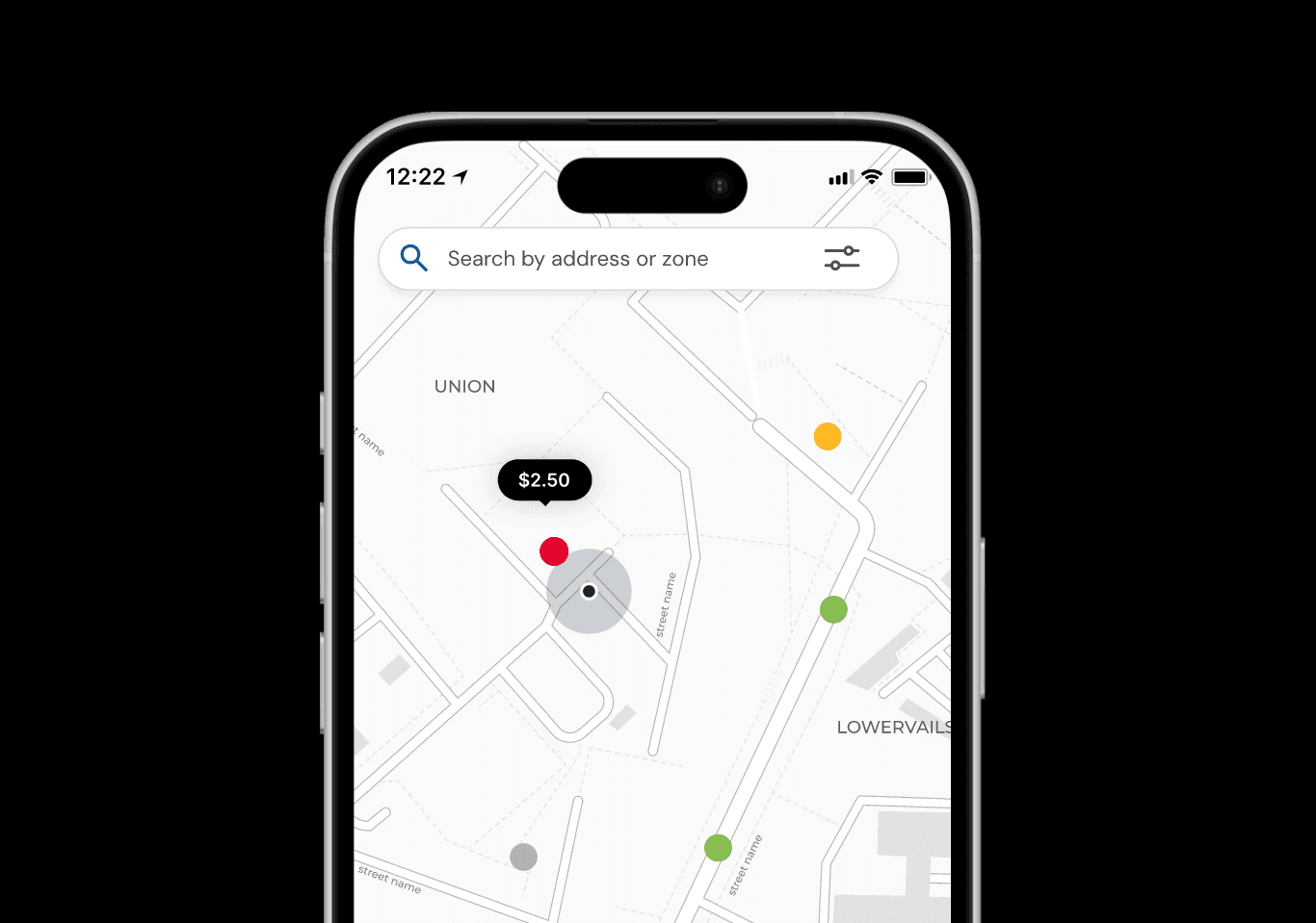
Users found it difficult to find available spaces, often circling the block to find one. The Park Chicago Parking app is separate from the Park Chicago app used for payment and only 1 user knew it existed.
SOLUTION:
Integrate the parking map directly into the Park Chicago app so that it is discoverable and useful but not obtrusive to users who may not use it.

INSIGHT #4:
When first using the app users reported low/mixed confidence with correct zone selection and parking rules.
SOLUTION:
Add a confirmation screen with a map that shows the zone the user selected, giving users the ability to double check they have selected the right zone adding a layer of error prevention and recovery and boosting user confidence.

INSIGHT #5:
Some users reported having trouble extending their parking sessions or missing the end of their parking time due to poor notification from the app.
SOLUTION:
Make it easy for users to check their parking session time and extend it in app.
User Testing
We conducted two usability tests. The first was with someone who used Park Chicago daily, while the second was with someone who used it infrequently, only when they visited the city.
Insight #1: Zone selection popup frustrates
The infrequent user stated they felt more confident that their zone selection was correct with the confirmation popup window, while the daily user felt it was unnecessary.
Recommendation: Remove the popup and instead add a map to the checkout process that shows user proximity to the selected zone.

Insight #2: Keep the balance
Both users felt the payment process was simple and straightforward. The frequent user noted that she likes reloading and paying with a balance because that is what she does daily, so removing it in our redesign was a pain point for her.
Recommendation: Continue offering multiple payment options, including saved cards for pay per session method and keep balance option for flexibility.

Insight #3: Make the map easily understandable
Both users did not initially understand what the colors on the map signified
Recommendation: Enhance visual cues, add map marker clarity (map legend) to better communicate distances and zones.

Reflection
Context is important: in what situations are users interacting with an app? What emotional states or other factors need to be kept in mind when designing? Ideally we would have conducted our contextual interviews while users are actively paying for parking so we can best understand their emotions and routine.
Disruptive design changes can erode user trust: while the changes we made to the app felt necessary and a stark improvement to us, testing our prototype with an everyday user showed us that changes can be disruptive to a user routines. I want to keep this in mind when redesigning systems in the future.
Design for more than just the "happy path": design systems need to accommodate fringe cases. Designing error states, disabled buttons, and ensuring designs are responsive can help maintain consistency.
LET'S GET IN TOUCH !
ally.ohr@gmail.com
© 2026 ALLY OHR